Check Out This Chart Before Getting a Tattoo
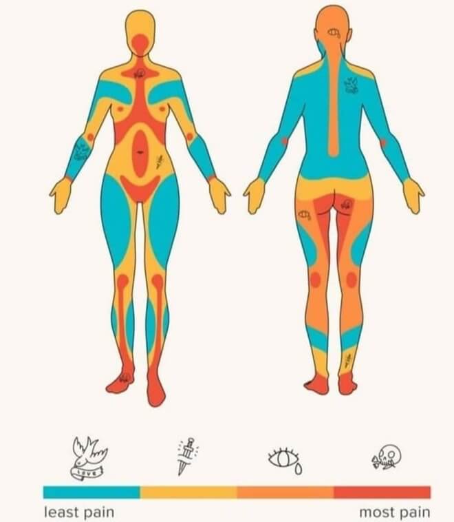
If you're thinking about getting a tattoo, then take a look at this chart first. It maps out how painful each area is to get a tattoo. Some are quite obvious or common knowledge, such as getting a tattoo on your ribs. However, others like your upper chest seem like they would hurt more to get tattooed. The facial area makes sense that it would hurt more, as does the calf area.
There is even a handy legend at the bottom that's illustrated with some pretty cool tattoos. The dove is representative of the least painful areas and the skull most painful.
How Secure Is Your Password?
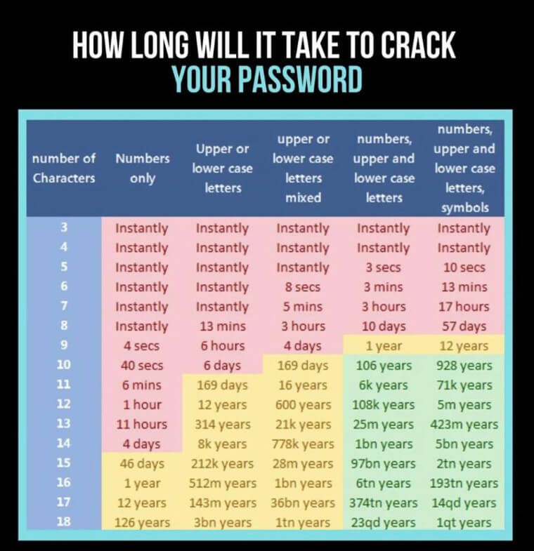
It's hard to fathom just how insecure most of our passwords really are, which is probably why someone made this handy chart. It shows an estimate of how long it would take for someone to crack your password if they really wanted to. Of course, this is probably with the use of some kind of program, but it's still kind of scary to think about it. Even passwords up to eight characters aren't very safe.
If this doesn't get you thinking about upgrading your password strength, then we don't know what will.
The Development of a Baby's Vision
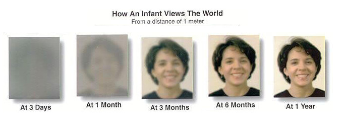
If you have a newborn, then you might be forgiven for thinking that they can actually make out your face clearly. But, as this chart shows, a baby's vision doesn't even begin to allow it to make out facial features until they're around three months old. Things start to get a bit clearer at six months and then fairly clear at one year. By the time they're three, their vision is fully developed.
We find this actually kind of surprising, and it just goes to show how much time it actually takes for our bodies to develop when we're toddlers. At least the chart shows how long it takes for our eyesight to develop.
The Evolution of the Alphabet
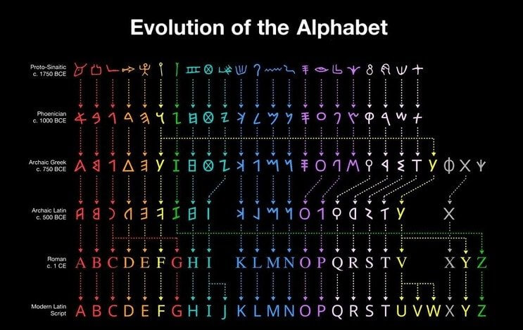
If you've ever wondered how Latin-based alphabets came to be, then this chart is for you. While it doesn't go into detail, it does show the change in the appearance of each letter throughout its history. There's also some interesting stuff happening if you look closely at each letter. For example, what appears to start off as the letter "T" eventually morphs into the letter "U." The letter that produces the sound we know of as "T" actually started off looking like a "W."
Then you have some letters that have barely changed at all, such as the letter "A" or the letter "B." You can also trace the letters back to when they were basically just symbols for different items.
Curious What It's Like to Have Colorblindness?
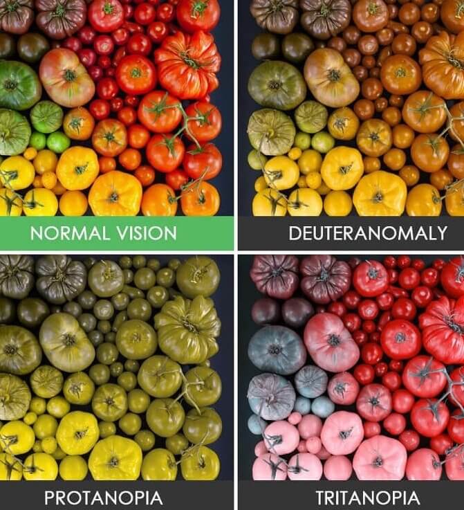
If you don't already have some form of colorblindness, then you've probably wondered at some point what it would be like to not be able to see the normal spectrum of colors. This chart takes four different forms and compares them using a photo of vegetables. The photo on the top left is what someone with normal vision would see, while the rest reflect what the same photo would look like if you were colorblind.
This is also pretty useful if you know anyone you might suspect of being colorblind. You can just use this chart to ask them what colors they see and if they match up.
What Human Emotions Look Like in Our Bodies
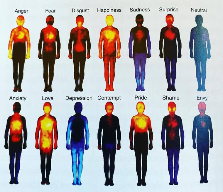
We've never seen a chart quite like this one before. It shows where in your body different emotions tend to be felt and whether that manifests in heat or just numbness. It's basically a heat map for emotions, like the photo says. However, seeing some of these in chart form really puts things into perspective. For example, the heat map for depression is quite saddening even to look at, while the representations for love and happiness make a lot of sense.
The visual representation of shame is also kind of eery-looking. This chart was actually put together by researchers from Finland and turned out to be pretty accurate, according to NPR. The team said that they hope it can be used by psychologists to treat disorders.
Think Twice Before Putting New Stickers on Your Car
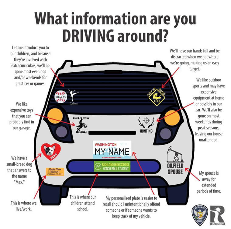
There have been plenty of studies surrounding what your bumper sticker says about you as a person, and surprisingly they can say quite a lot. This chart breaks down some of the more common stickers out there and gives you a description of what each one says, so beware what you put on your car. The sticker of an oil rig, for example, can convey to someone that your spouse is probably gone most weekends. That's because they probably travel for refinery work or work offshore.
Others include things like giving strangers information about your children's school or that you may be gone on weekends. There have also been studies done that suggest the number of bumper stickers you have correlate to how aggressive you are.
Land Formations Finally Explained in a Way We Can Understand
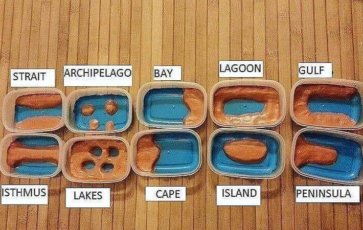
Remember all those classes you took in grade school and those sections that went over the different types of land formations? Well, this is kind of like that, but made in an easy-to-comprehend way. All of the different types are shown here, from islands to isthmuses. While we remember most of these from school, things like lagoons, capes, and isthmuses look completely new, and it's cool to see them next to their counterparts.
However, the lagoon should probably have a much larger body of water somewhere in the same Tupperware container. They are usually only separated by a small landmass and see recurrent spillovers.
College Tuition Has Gotten Out of Hand
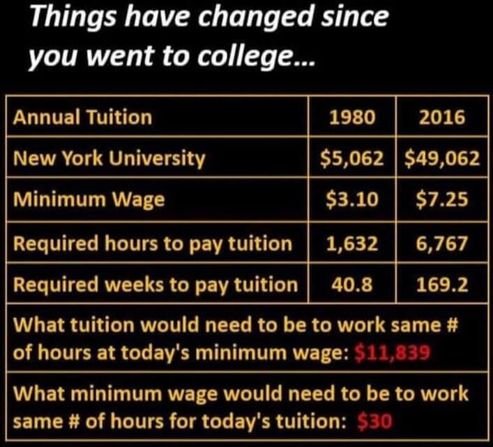
This chart is not political, but it does show how the gap between medium incomes and college education has widened over time. In 1980, most people could work minimum wage for $3.10 per hour and pay off their tuition in around 40 weeks. In 2016, that number had risen to around 169 weeks. It also tells you what the minimum wage would need to be in order to match the number of working weeks in 1980.
This is a great example of a chart that takes a complex subject and distills it down into a visual representation. It's also pretty disheartening to see that the gap has widened so much in so little time.
But on the Bright Side...
Remember that college tuition chart from earlier? Well, this one tells you what you can make if you forego a college education in favor of a trade job. Perhaps the most surprising pay on here is that of a hairdresser, but it just goes to show that there are plenty of high-paying jobs out there, even if you don't go to college. Most of the other jobs are pretty in line with what we assumed you could make.
However, it should be noted that these are just averaged out, and you could possibly make much more, especially if you eventually decide to open your own business after getting some experience.
Which Birth Dates Are Most Common?
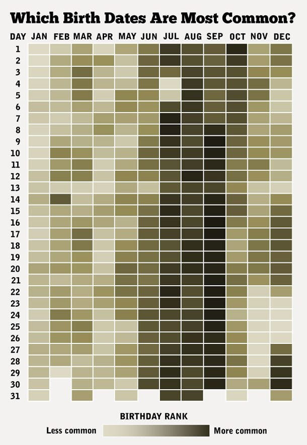
Have you ever come across someone else with the same birthday as you? Well, this chart maps out the commonality of different birthdays throughout the year. That's right; it actually tells you how common your birthday is, which is a little weird. It makes us wonder how these patterns form in the first place and what causes a birthday to be common. Either way, there's some pretty cool information packed into this chart.
Birthdays in July, August, and September seem to be pretty common, while January seems to be a rare month for birthdays. The 31st of each month can also be hit or miss, but that's probably because not all months have 31 days.
A Handy Trick to Remember the Days of Each Month
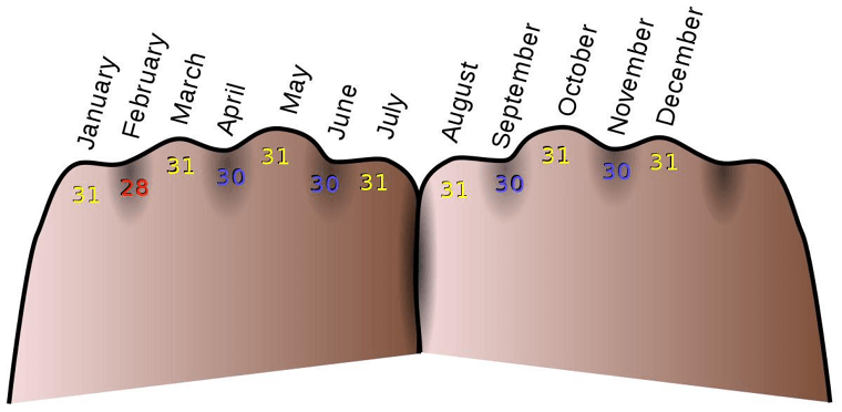
This handy (forgive the pun) chart helps you remember how many days are in each month. You can use your knuckles to count out each month, with every month that lands on a knuckle accounting for a month with 31 days. The months in between each knuckle usually only have 30 days, but of course, February has to be different with 28 days. As long as you can remember that one odd month, then you're all good to go.
February comes towards the beginning of the count, so it shouldn't be too hard. Everything else falls into place perfectly, though, and lines up just as it should.
Moral of the Story: The South Can't Handle Snow
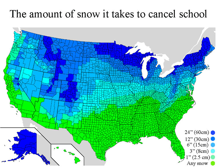
This particular map depicts the amount of snow it takes to close schools. As you can see, there are plenty of places that completely shut down as soon as the first snowflake drops. However, plenty of unlucky students to the north and midwest are stuck going to school even if the snow piles up to two feet. It's a bit weird that there actually aren't that many places in New Mexico that shut down completely when it snows.
We didn't know they had enough equipment to handle heavier snowfalls. You would also think that some places in Tenessee would tolerate at least some levels of snow before shutting down.
What Hair Color Will Your Children or Grandchildren Have?
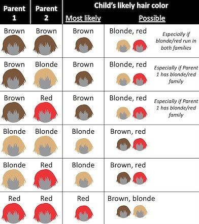
Predicting the hair color of a child can be a fun little activity for parents to be, and while this chart isn't going to tell you with certainty what hair color your child will have, it's still pretty neat to look at. Of course, one would think that two parents with brown hair would have a brown-haired child, but what really stands out is how red hair is present no matter the hair color of the parents.
This might be because red hair is just the result of a gene mutation. However, it's interesting to see just how likely two parents with the mutation are to produce red-haired offspring.
These Companies Hire Felons
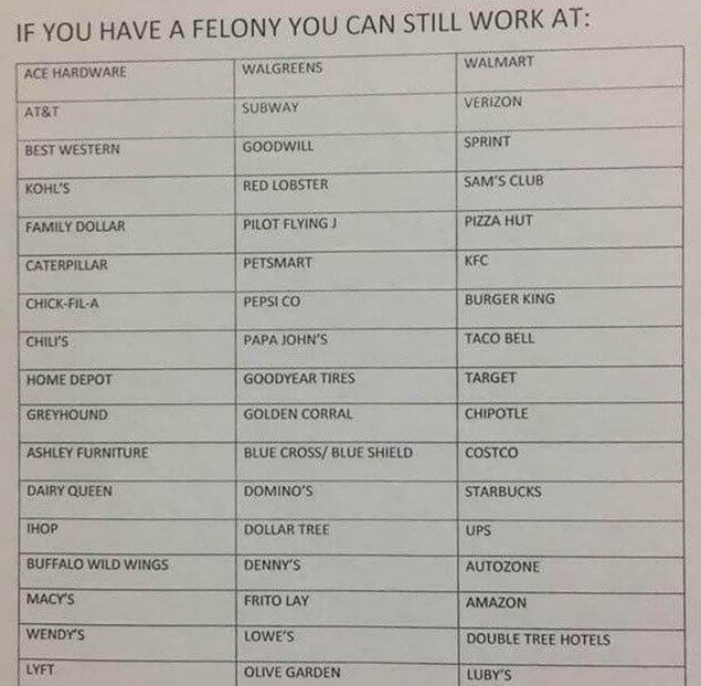
This cool bit of information lists off some of the more common companies that hire felons. This is actually really cool because if someone has served their time and is trying to restart their lives, it can often be hard to find a job as many won't hire people who don't have a clean record. This can lead people to turn to crime in order to get by, turning into a cycle of incarceration.
While some of these aren't the highest paying jobs, many do offer paths to higher positions and good benefits, such as Target, Starbucks, and Amazon. Goodyear Tires is also a pretty big company to work at.
How Much You Have to Make to Join the 1%
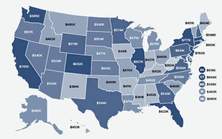
Apparently, the 1% is not created equal, and this chart shows just how much you need to make in each state to be considered a part of the 1%. The map is really interesting because it not only shows you how much you would need to make to be a part of the 1%, but it also represents the insane variations in the cost of living across the U.S.
The cost of living is notoriously high in California, but from looking at this chart, you can tell that a state like Mississippi is much cheaper to live in. Someone that is considered part of the 1% in one place might only be considered moderately rich in another.
How Long Adopted Dogs Need to Feel at Home
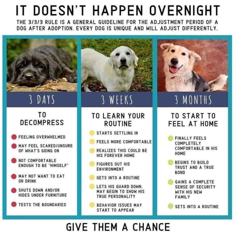
Dogs are great companions, but like any companion, whether they be human or otherwise, it takes a while to build bonds. This chart maps out exactly how long it should be before you start seeing your canine friend develop some of these behaviors. For example, a dog is not going to feel "at home" as soon as they get to your house. And you probably wouldn't feel at home in a stranger's house on your first day either.
However, the chart shows that dogs start to settle in at three weeks and begin building trust and forming lasting bonds at three months. They also start to set routines, so anytime before this is the time to encourage good habits.
Macaroon Vs. Macaron Vs. Macron
French is hard, but it would make sense that someone out there who speaks French would make this chart just to show English speakers how much they're butchering the language. This chart gives readers easy-to-understand pronunciations of some common French words, such as macaron and Macron. The latter being the current French president and the former being a desert. It also gives readers a definition of each, in case they weren't aware. Thanks, France.
So, now there is no reason not to know the difference between macaron and macaroon. One snack is almond-based, and the other is coconut-based. They also have different textures, apparently.
How to Get the Chef to Hate You
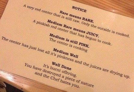
This handy little guide was apparently found on a menu at a restaurant, probably a steak house, and it gives diners a description of the different ways they can have their steaks done. It starts with rare and works its way down to well done. And of course, it has a funny a little comment for anyone who prefers their steak well done. However, this is actually a pretty handy guide.
It's especially handy for anyone who may not find themselves eating steak very often. It also attempts to show them the light if they decide to order their steak well done.
The Chart Every English Teacher Needs
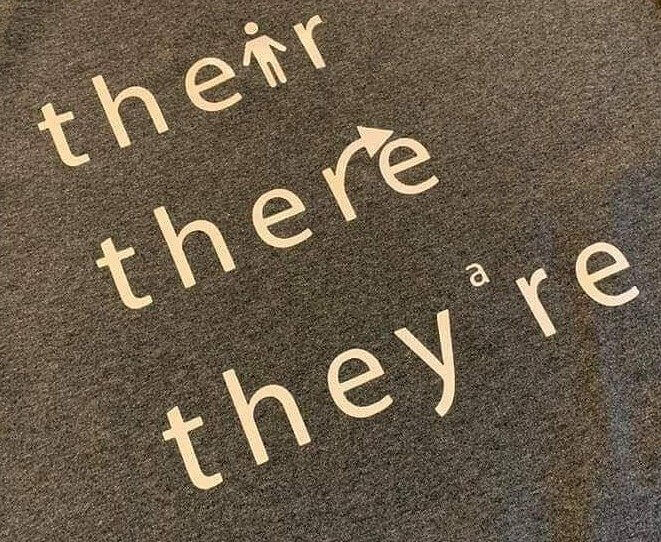
This isn't necessarily a chart, graph, or map, but it's still pretty cool nonetheless. This shirt can be used as a simple reminder of when to use there, their, or they're. It even gives you a couple of neat visual cues to quickly identify and remember when to use what. It's a simple concept, but it's still pretty effective, and we'd totally order one of these if we knew where to get it.
It kind of makes you wonder why they don't use this same concept for other shirts or even throw it on some posters and sell them at places like bookstores.
Instructions For the Perfect Fort
This would've come in handy when we were younger. Most of our forts ended up being a collection of sheets, but these directions show someone how to make a towering sofa fort worthy of any imaginary battle. The directions are also relatively simple, but we guess they have to be to reach their target audience. Even so, we might be giving this a try on nights when we have nothing else to do.
Of course, if you have two sofas, you could probably even combine them. The possibilities here are almost nearly limitless. Yeah, we're definitely giving this a try.
If You're Ever Falling off a Waterfall, Here's What to Do:
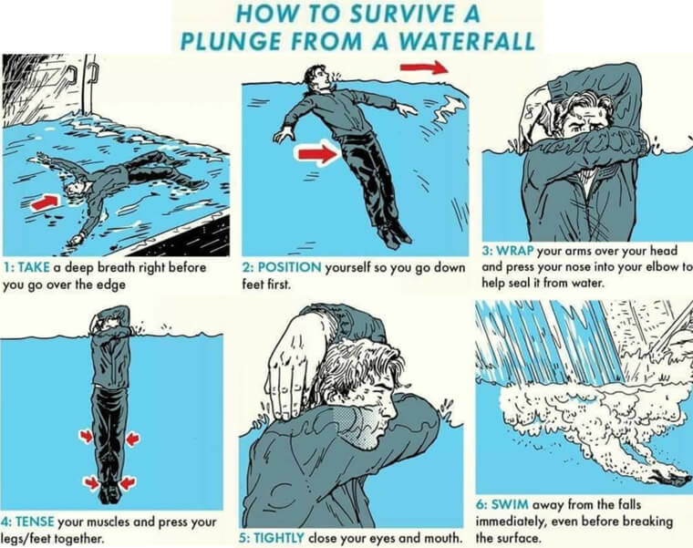
A chart you never thought you'd need (unless you're a child that watches cartoons), this chart explains how to survive falling down a waterfall. All you have to do apparently is lay flat and position yourself feet first going down. After you hit the bottom, you're going to want to swim away as fast as you can, probably in order to prevent yourself from being sucked down even further than you already are.
A side note: This would actually make for a pretty cool poster to hang on your wall. The illustrations here are great, and the colors are even better.
Get Your Plaids Straight
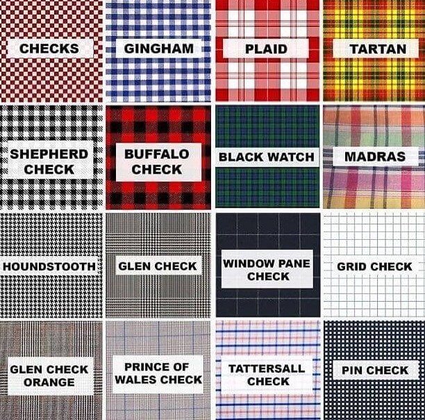
This one is for those that consider themselves to be fashion savvy. There are plenty of different types of patterns and plaids out there, and this chart breaks them all down and gives you the name of each. Not a bad little chart to keep in mind the next time you're trying to match up your wardrobe. It has the usuals, like buffalo check, but it also has some more obscure patterns like the madras.
We've also heard a lot of these names before, such as tartar, but didn't actually know what their particular patterns looked like. Thanks to this chart, we no longer have to wonder.
Hack Into Your Happiness With These Tricks
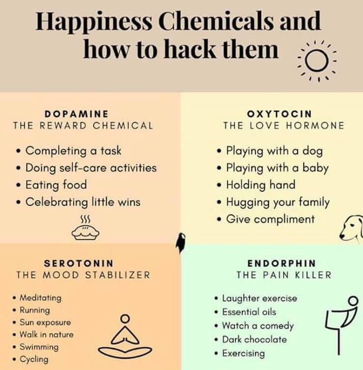
This little handy chart lists out the different ways in which you can encourage your brain to release different chemicals. It also tells you what the different chemicals actually do. It's interesting to see all of the activities and each one's effect on your body, and some of these really make sense after looking at this. For example, it makes sense that hanging out in the sun or taking a walk in nature would calm someone down.
It also makes sense that completing a task would release dopamine. However, we weren't aware that playing with a dog releases oxytocin, which is sometimes called the love hormone.
Here's How to Get First in Line at the Emergency Room
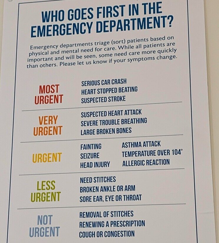
This chart was put up in an emergency room to probably remind patients that their cold doesn't qualify them to be seen by a doctor if paramedics rush in a heart attack victim. It was also a nice touch to add those being affected by mental health issues at the bottom. However, it is weird that someone having an allergic reaction would be seen before someone with a broken leg.
But the person having an allergic reaction is probably more at risk of death, whereas a broken leg is just going to cause a lot of pain. We just hope they give those people some pain medicine while they're waiting.
Tally Marks From Around the World
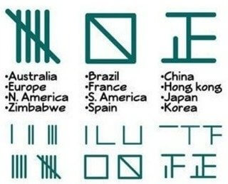
If you've gone to school in the U.S. or Europe, then you're probably familiar with the form of tally marks on the far left of this photo. However, did you know that other parts of the world actually use different forms of tally marks? Well, thanks to this chart, now you do. It kind of makes sense if you think bout it. However, what doesn't make sense is that Spain would use a different form than the rest of Europe.
The answer to that question wasn't posted with this photo, but it will forever leave us curious now. However, it would make sense that East Asian countries would use different forms entirely.
Elevation Levels In The United States
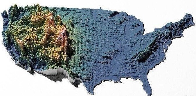
Pretty much everyone knows that the U.S. has two mountain ranges on either coast that run north to south. However, this map puts the scope of those elevation changes in perspective. It also shows just how flat a lot of the rest of the country is. Even the Smoky Mountains' elevations seem small when compared to the Rockies. There are also a couple of standouts hidden away in here, such as the Ozarks.
The elevation heights in Washington state and Oregon also came as a surprise. However, maybe the entire western U.S. is just elevated to a much higher degree than the eastern U.S.
The Human Body's Levels Of Decay
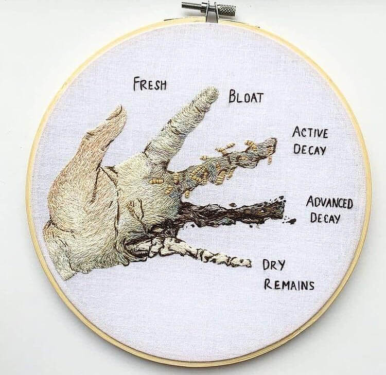
We aren't sure why you might need this visual aide, but if you were ever curious about the different stages of decay, someone illustrated them here. The piece is quite good, and it shows what a body might look like while it's fresh all the way to when there's nothing left but bone. Again, not sure why anyone might need this, but it could perhaps be useful for someone studying to become a coroner.
It's also just kind of neat to look at since it was done so well. The piece was done using needlepoint, which is quite impressive, even if it gives off serial killer vibes.
This Is How Taxing the Rich Actually Looks
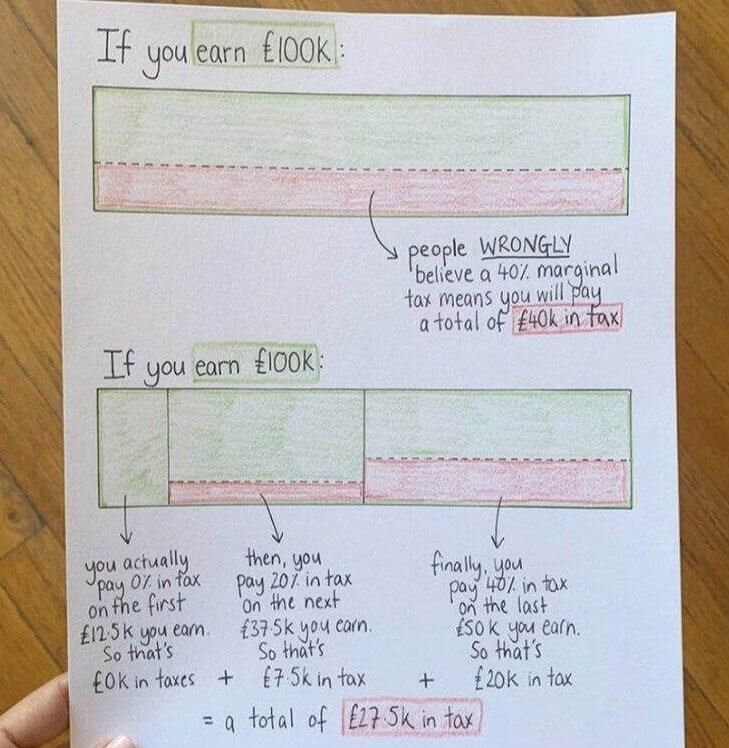
Okay, taxes, especially in the U.S., can be incredibly confusing, and this graph isn't going to make you a certified accountant. However, it is a good visualization of how taxes actually work as opposed to how we often think of them working. The chart uses a simple square and corresponding colors to break everything down in an easy-to-understand way. For example, even if the rate is 40%, that doesn't necessarily mean you're going to pay $40,000 on $100,000 worth of income.
Instead, taxes are usually staggered or tiered in a certain way, meaning you actually pay much less. The graph is just a quick tool to help you estimate what that amount might be at the end of the year.
Understanding Aircraft Lights
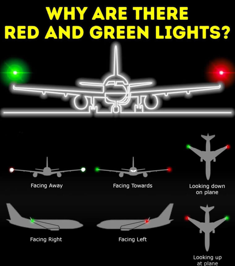
If you've ever looked up at the sky at night and seen a passing airplane, then you've likely wondered why they carry red and green lights. Well, it's actually so that other airplanes might easily recognize the position of the plane in the dark. The same thing applies to lights on a boat. This chart gives a description of what each position would look like and what it would tell the pilot.
For example, if a pilot saw a green light on the left and a red light on the right, then they would know that the plane was coming toward them. They would also know to get out of the way.
How to Google Like a Professional
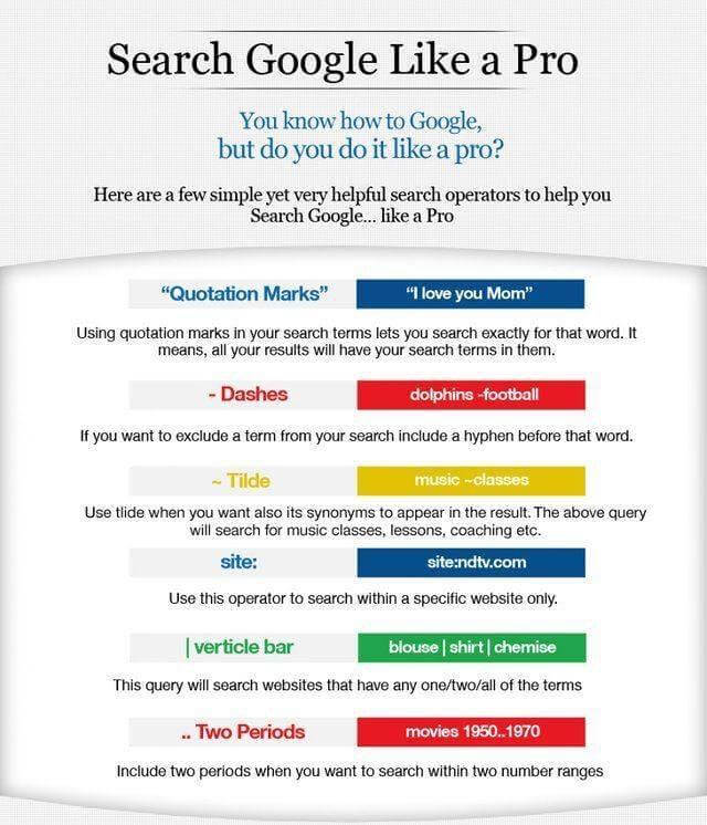
No, we're not asking you to google the word "chart." But, if you were to do that, then you could use this little guide to Google like a pro. The search engine has built-in shortcuts or tips for googling in a specific way. For example, if you want to search number ranges, then all you have to do is add in a couple of periods or full stops between numbers.
If you want to make sure results only show pages with a specific search term, then you can put that term between quotation marks. We've actually used some of these before, and they really do make a world of difference.
How to Tell People You Don't Work for Free
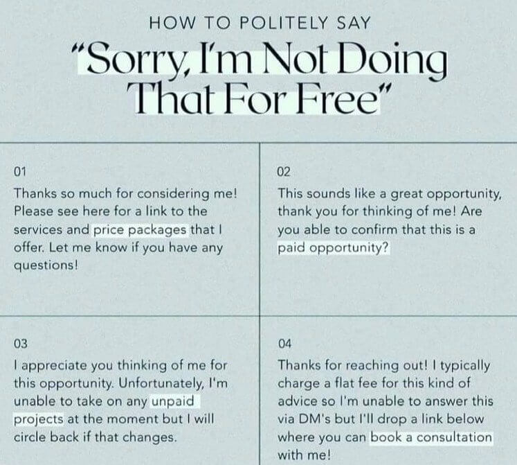
It can be hard to convey to people that you are no longer, or never were, working for free, especially if a friend asks you if you can provide a service to them. However, this little explainer gives you some common sentences and language you can use to say — politely — that you're not going to do that for free. Often, it's enough to just bring up the phrase "paid opportunity."
However, you can also just be a bit more direct, which is usually the better route, and ask nicely if something is a paid project. The chart also provides polite ways to turn down unpaid work.
Helping A Friend Who Smoked Too Much
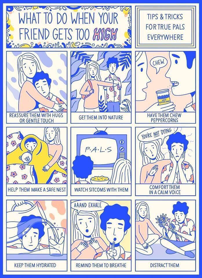
This chart gives you some tips on what to do if you have a friend who happened to smoke a little too much. It includes helpful information on how to keep them calm and reassured, including giving them things like peppercorns or taking them out into nature. It's never fun having a panic attack, and this is a good way of preparing just in case someone you know has a bad reaction to marijuana.
Other tips include sitting them down to watch some T.V., keeping them hydrated, and reminding them to breathe. Not a bad chart to have around in case of emergencies.
These 3 Symbols Aren't All the Same
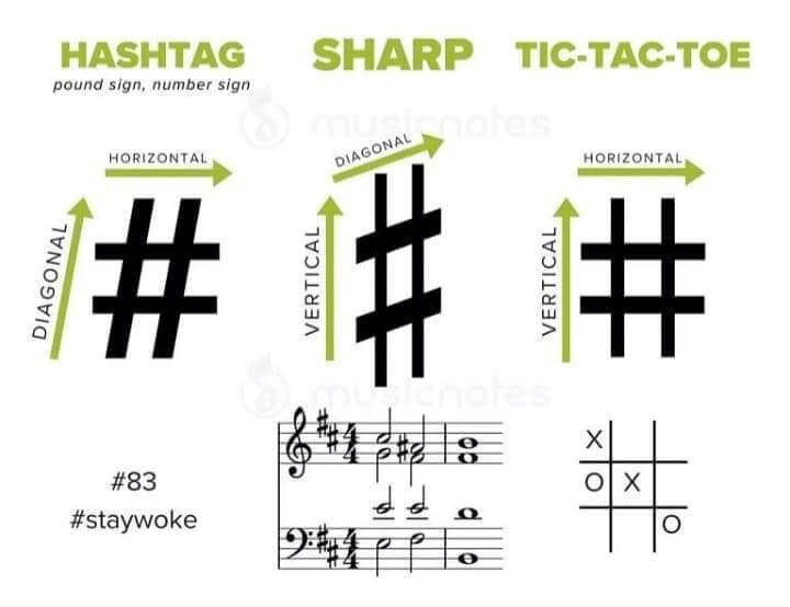
Yes, it's not always a hashtag, nor is it always a pound sign. There are actually subtle differences in this common symbol, and this chart explains them and what they're used for. As you can see from the photo, the hashtag symbol is actually slanted a bit, while the symbol we use on our phones or for playing tic-tac-toe is completely straight and aligned. There is also a different symbol for musical notes.
The sharp symbol is stretched vertically when you see it on sheet music. Now, if you ever have to write a hashtag symbol by hand, you know to make it slightly off-kilter.
How to Take the Perfect Nap
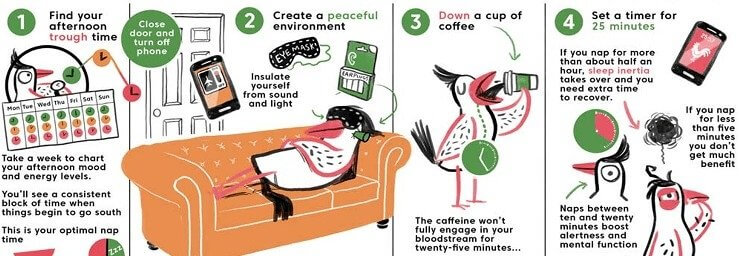
Researchers have come to find out that naps taken in intervals of around 15-20 minutes can actually help us be more productive. And this little chart shows how to get the perfect amount of rest without being too foggy when waking up or not to stay asleep for long enough. Surprisingly enough, the best time to take a nap is when you usually start to feel yourself becoming a bit drowsy.
It also advises that you chug some coffee before lying down to take your nap. The coffee won't take effect until right when you're supposed to wake up, but you better hope you're one of those people that can fall asleep as soon as they lay down.

