Who Was This Door Made For?
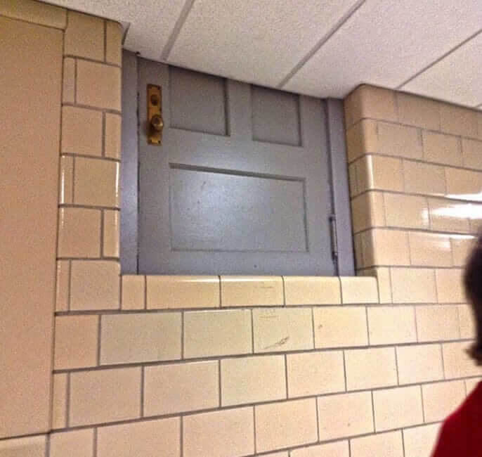
Okay, so we're not saying that there's been some kind of tear in space-time or anything at this school, but just take a look at the door in this photo. There's no way someone actually designed for this thing to be there like it is. The ceiling is literally halfway up the door. It looks like something out of a Dr. Strange movie, or maybe something out of the Twilight Zone.
Still, it would probably be pretty cool, or at least interesting, to go to this school and walk past this weird door every day on your way to class.
It Was Doomed From The Start
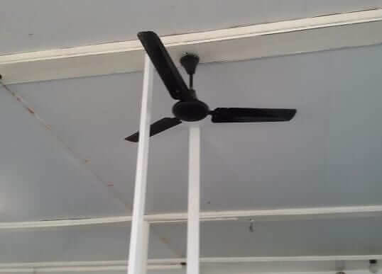
This poor fan never even had a chance. For some reason, someone decided to erect a pole right between the blades. There could be a perfectly reasonable explanation for this, such as they were needed to support the ceiling or something, but we just aren't sure. We are sure that nobody ever used this fan again. Or at least, nobody ever used it successfully as the blades would just run into the pole.
Hopefully, they ended up just moving the fan in the end because otherwise, it would've just been a waste of money. It's also possible they ended up moving the poles; one of them had to go.
Bad Locker Placement
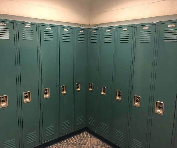
School lockers are usually great solutions for storing items. However, not so much when you place them like they're placed in this photo. The lockers in the corner right next to each other probably can't even be opened. If they can, then it's only going to be possible to open one at a time. We'd hate to be assigned one of those two lockers, and we imagine whoever was assigned those lockers probably also took this photo.
We get that it's probably pretty hard to jam enough lockers into a school to accommodate all of the students but we're sure they could've found space for those somewhere else.
Right In The Pathway
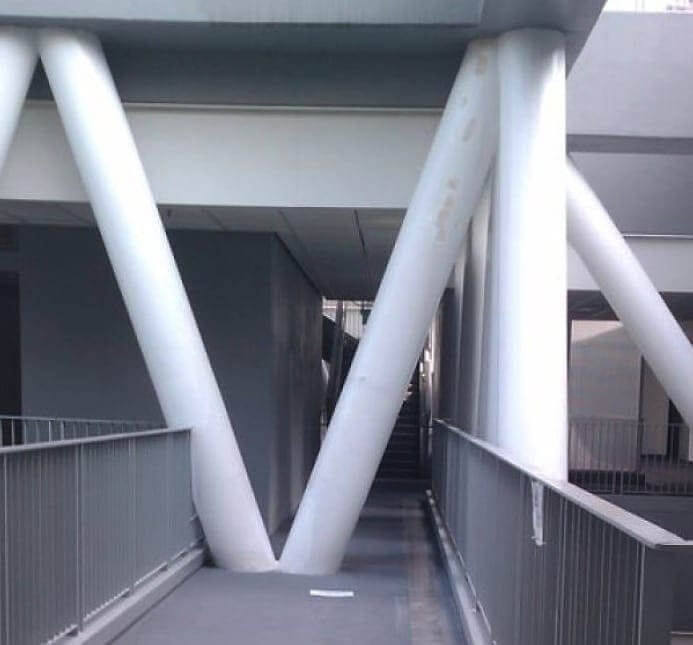
Architecture, first and foremost, should serve a purpose. At least, we think that's the case as none of us ever majored in architecture. At least not like the people who go to this school, which is a university for design and art. So, you'd think a school for design would be able to get its own building right and not have a couple of giant columns protruding right into the middle of a walkway.
However, it looks like someone probably got a little bit carried away with their design and didn't want to let go of these columns, even if they ended up being placed in an inconvenient location.
Competing Messaging
We've personally never seen something like this, but it apparently shows a school bus with an advertisement on the side. We guess whatever school system this is wasn't receiving much funding from the district. Anyway, there appears to be an ad urging people to quit doing something, probably smoking or drugs. However, the way it reads, it sounds like it's urging people to drop out of school and quit trying to get an education.
The ad was just obviously misplaced, but you'd think that in a building filled with educated people, someone would've noticed this and started asking some questions. Instead, it looks like students or someone random from the town noticed and snapped a photo.
Maryland Was Just Atlantis This Whole Time
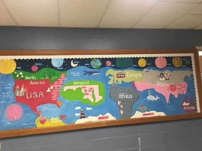
Teachers and schools are always harping on geography, and there's a pretty big stereotype out there that Americans aren't very good at it. We think we may have finally figured out why. Take a look at this world map, which shows the state of Maryland as a giant island out in the middle of the Atlantic Ocean. It's nearly bigger than the entire continent of Europe, for goodness sake.
This school was probably just located in the state of Maryland and they wanted to make sure that the state was depicted clearly, but it still looks a bit weird on this map.
Time To Look For A New Architect
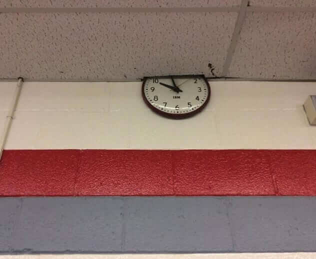
We're sure there's a story behind why this particular clock is hung so that it's halfway into the ceiling, but we just don't know it. Whoever hung it, could have literally placed it anywhere they wanted to, yet they chose to place it so that nobody can see the top half of the clock. That might've been intentional, since it also looks like they had to cut away some of the ceiling panels, too.
It's just hard to believe that this one was done on accident, which makes us want to get to the bottom of why it was placed like this even more.
Try Not To Score Here
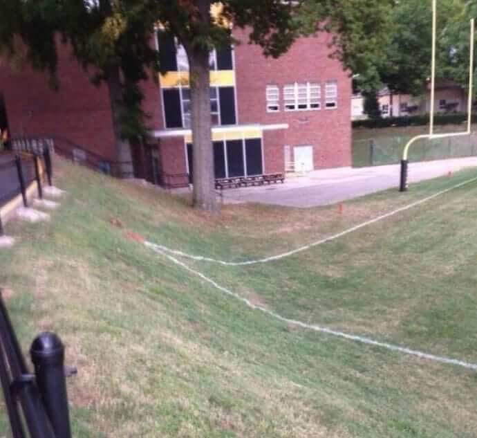
Unless you play sports, it's hard to appreciate just how important a good field or court is. They can make all the difference when playing a game. Just take a look at this field, which for some reason, has a slope in the corner of one of the end zones. We have to imagine that there have been plenty of injuries on this field as a result of the slope, too.
If you're a wide receiver running full speed and turning back to look for the ball, the last thing you want is a sudden elevation change that could leave you tripping up in the end zone.
Something Isn't Quite Right Here
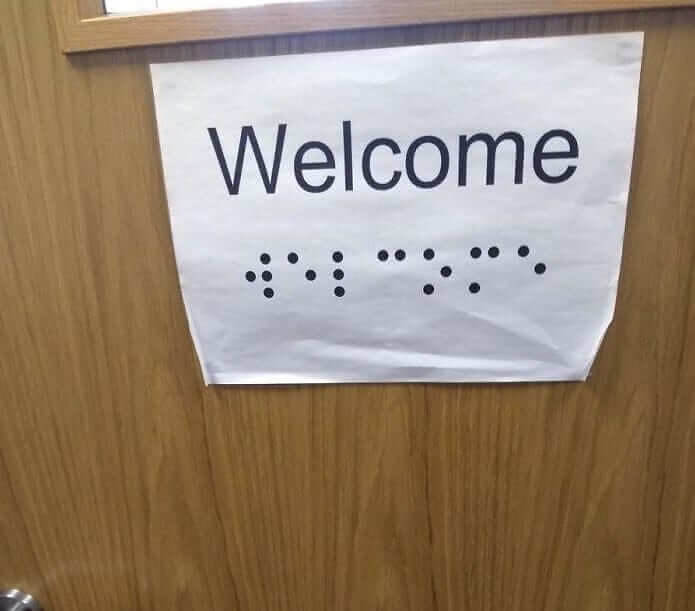
This sign looks like it was hung on the door of a teacher's office, which would make it even sadder. The point of braille is to give people something to read through touch, but nobody is going to be able to feel the ink on this piece of paper. There's literally no point in printing out this sign unless you were going to add some beads or something to spell out "welcome" in braille.
However, we aren't seeing any beads or anything in this photo, so hopefully, whoever noticed and snapped this picture, went and informed someone so they could get another sign.
Traffic Jam
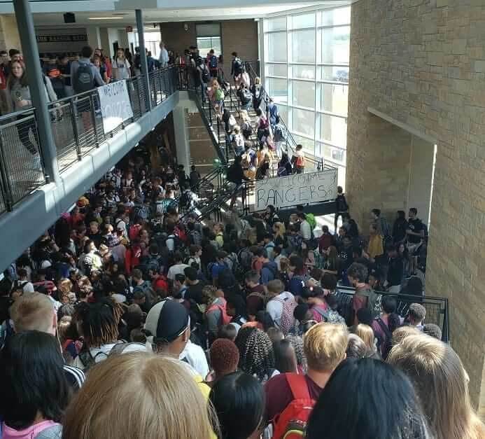
Part of the job of a school building is to make sure that students flow to and from class in an efficient manner. Nobody told that to whoever designed this building. You have like four (that we can see) paths leading to this singular junction, and it looks like it gets pretty cramped when people are moving from one class to another. This actually looks like it could be dangerous if there was ever an emergency.
Maybe more so than that though, it just looks like it'd just be a nightmare to navigate through every single day, whether you're a student or a teacher.
Look But Don't Touch
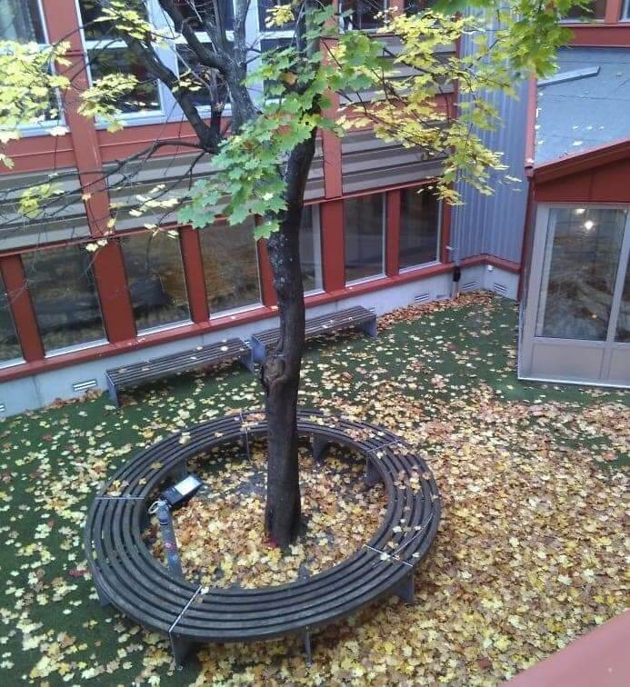
At first, you might assume that this is a pretty tranquil scene, and it is. However, it's also a really big oopsy from whoever designed this courtyard. That's because there isn't actually a way for people to get into this little park. That's right, those benches are basically there for no reason because people can't access this space and sit down or enjoy the tree. Why that is, we're not exactly sure.
It's also kind of weird that even after this space was built at this school, nobody felt the need to add a door later. It might be a little pricey but it'd be worth it.
The Door To Nowhere
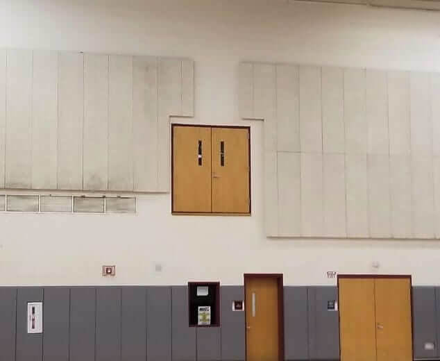
This random door in the middle of a wall is making our brains hurt, but it's also really intriguing. Like, where does this door go? We kind of just want to open it to find out. We also want to know how and why it got there in the first place. We're sure they didn't just place a door halfway up the wall for no reason. There must've been something there before.
However, we don't see any other signs of railing or anything like that, so this one is a bit perplexing. Maybe they did just place it there to make people wonder what's behind it.
A Very Minimalist Bathroom Layout
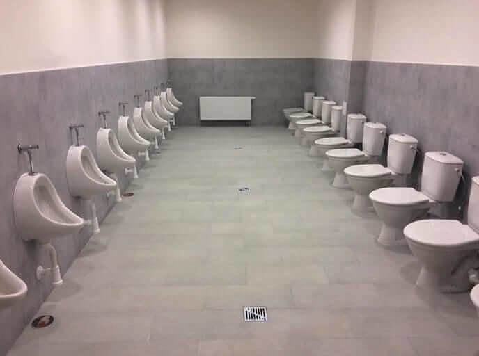
This photo looks like it's straight out of a quirky movie or something. We just can't make out what is going on here and if this is even a real bathroom in a real school somewhere. Why on earth would anyone take the doors and walls out of the bathroom? Honestly, this bathroom looks like it'd be more at home in a prison complex than in an actual school somewhere.
Whoever designed this bathroom clearly didn't have privacy in mind, and we imagine not many people are actually using those toilets. They didn't even put dividers between the urinals.
Gee, Thanks?
The irony in some of these design choices from design schools is strong. This school sent out these cards to potential and former students. This student noticed the bad design choices on the card and decided to photograph the card and post it online. It's meant to be read from top to bottom, one column at a time. However, that's not really that clear, and instead, it ends up sounding like gibberish.
You could also read it according to the colors, but it would just be the same as the third rows contain the same words. We kind of see what they were going for, but it just doesn't work.
The View From The Outside
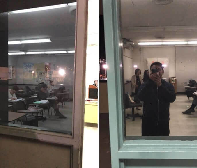
It's kind of hard actually to make out what is happening in these two photos, so we'll give you a quick rundown. Basically, the classrooms in this school have tinted windows on the doors. That means that people can see inside the classrooms, but those inside can't see out. This might not sound like a big deal, but just consider the fact that someone could be outside watching a class, and nobody would ever know.
That could be pretty dangerous, especially if there was an emergency with an active shooter or something like that. People inside would have no way of knowing if the shooter was outside the classroom.
Not Much Forethought Went Into This School
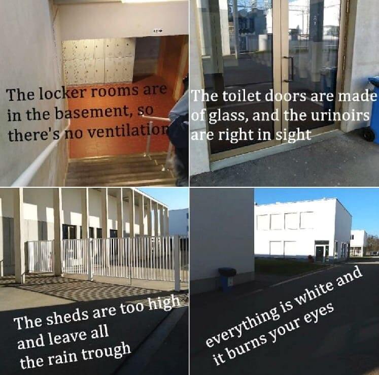
The last thing you want is for a student to go around taking photos and listing all of the architectural deficiencies of your school. Yet, that's exactly what his student did. He took four photos and wrote small captions for each, detailing what was wrong with each scene. For starters, the lockers were placed in the basement, where there was absolutely no ventilation. That's not something you want when dealing with funky lockers.
For some reason, the bathroom doors were also made of glass. We don't really have to explain why that might not be the best idea. This student also took issue with the fact all of the buildings were painted a blinding white.
You Have To Squint Real Hard
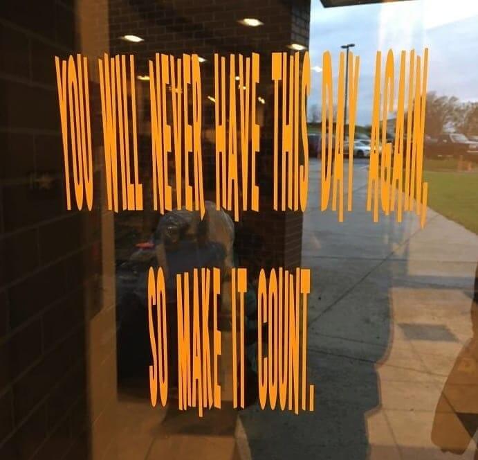
We'll go ahead and tell you what the sign in this photo spells out so that you don't have to squint too hard. It reads, “You will never have this day again, so make it count.” We're not really sure why they went with this font, which looks more like an optical illusion than an actual sign to be read. But, maybe that's just all they had on hand at the time.
We can't imagine anyone would look at this font at first glance and go, "Yep, that's the one right there. There's no need to keep looking for another one."
Yeah, The Imagery Here Isn't The Best
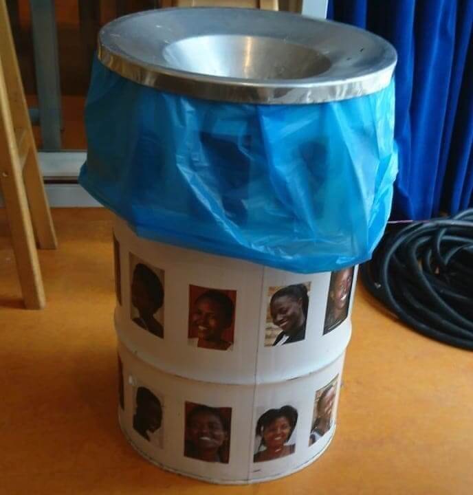
So, we'll be the first to admit that design isn't always easy. However, that said, we're sure you don't have to be a design professor to spot that this trash can might send the wrong signals. We're not entirely sure why it has a bunch of photos of Black women on it, but it's just a bit tone-deaf to make or produce something like this and then just place it around the school.
That said, the school did have good intentions, and it turns out they had produced a lot of photos of minorities and placed them around the school to spread awareness; they just should've chosen the places better.
Someone Didn't Think That All The Way Through
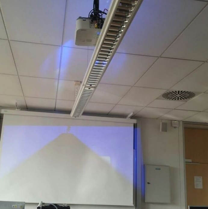
Projectors are pretty ubiquitous pieces of classroom equipment. We mean, it's not like they just sit in the classroom and aren't used or anything. So, that makes the decision to hang the railing right underneath one a bit confusing. It ended up making the projection look exactly as you might expect. That is, it looks like there's a giant rail blocking it and causing a shadow to be thrown across the board.
We suppose that this teacher can still use the top two corners of their board, but that's going to be pretty awkward. Instead, they'll probably just have to go back to using the blackboard.
Lets Play A Game
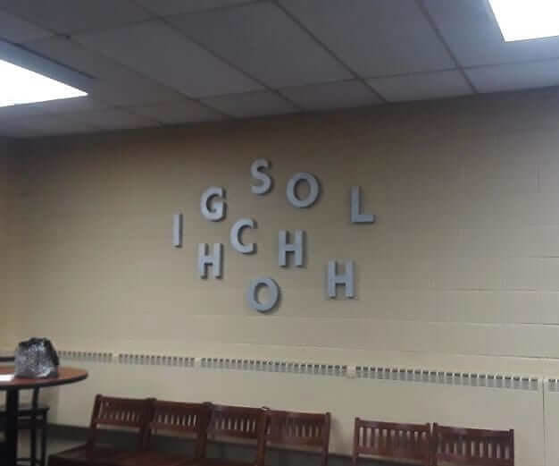
No, it's not just you. There's no pattern here or way to read this sign so that it actually spells out "high school." It's just a bunch of scrambled letters that you're meant to decipher and spell out for yourself. And there's nothing wrong with that, but it does kind of seem out of place to have in a school. You know, the place that's meant to teach you how to spell.
Still, we get what they were going for here. They were probably just trying to hang a fun sign up on the wall that'd get people's attention and make them think for a second.
Scrambled Lighting
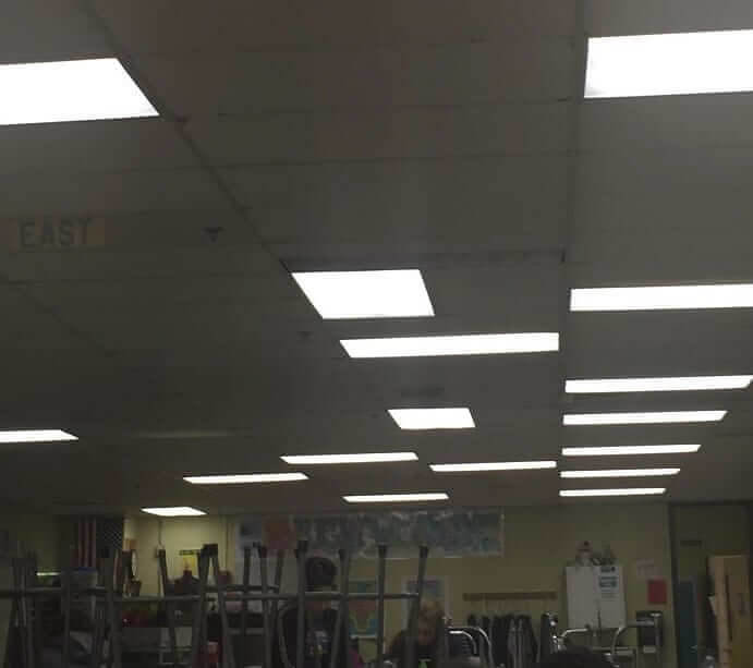
This one isn't really all that consequential in the grand scheme of things. We mean, it doesn't inconvenience anyone or anything like that, but it is just weird that someone would design the lights in a room to be like this. There isn't really any pattern or order here. They just look like they were placed randomly throughout the ceiling and left there. Honestly, the left side of the room could've used a couple of more lights.
Most classrooms have a couple of light switches so that teachers can choose to dim parts of the room, but it looks like this teacher doesn't really have a choice in the matter.
Keep Fingers Moving?
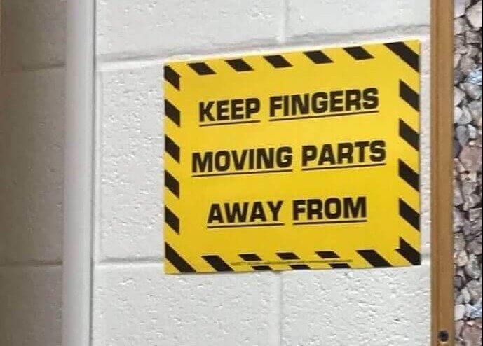
We'll spare your brain some hurt and just go ahead and tell you what this sign is supposed to say. It's supposed to read, "Keep fingers away from moving parts." However, for some reason, the second line was moved underneath the third. It now reads, "Keep fingers moving parts away from," which doesn't make much sense unless your name is Yoda and you serve on the Jedi high council.
However, for anyone else, it just looks like a sign that's telling you to keep moving your fingers for some odd reason. It could also probably use a red warning symbol.
Not So Efficient Use Of Space
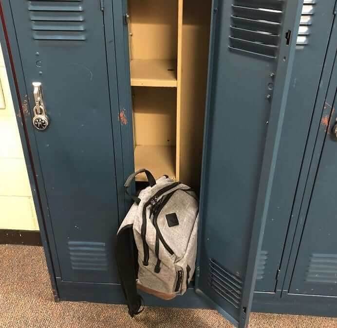
If we're being completely honest here, we never had lockers in our schools growing up, so we're not entirely sure that a locker is meant to be able to fit a backpack inside. That said, whoever took this photo seemed pretty sure. They were so sure that they seemed a bit irked that their locker didn't have enough space for their backpack. It also looks like nobody else's locker has much room, either.
Still, this isn't as bad as some of the other fails on this list involving lockers. At least this person can still fit books and other belonging into their locker.
Just For Looks
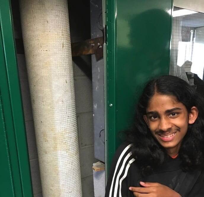
Whoever this was who got this locker really got screwed. As you can see from the photo, when you open the locker up, there's a giant pipe running up through it, meaning it's just there for show. There's not an actual way to store anything in there, much less a bunch of books. We hope they were eventually assigned a new locker because it sucks having to carry around heavy textbooks all day.
This photo actually kind of reminds us of those photos showing the facades of some buildings and how they're basically just for show and don't serve any real purpose.
Disregard The Earlier Sign
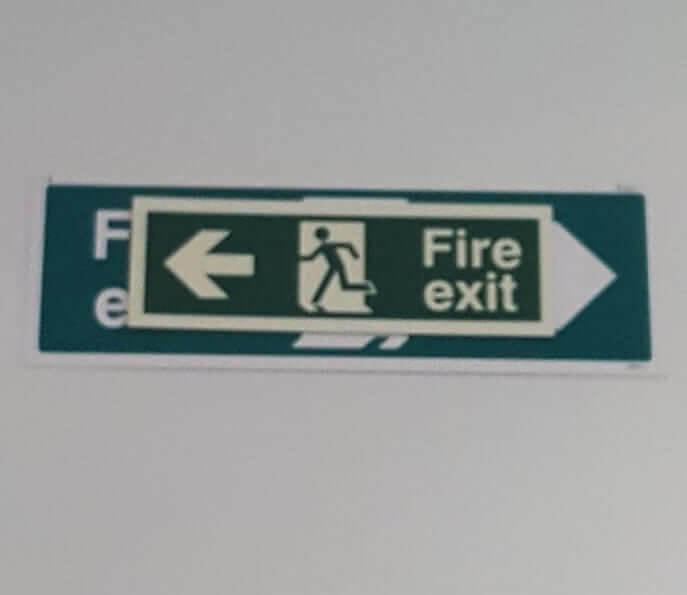
This one is honestly pretty hilarious, if also pretty unsafe. It's a sign telling people where to flee in case there's a fire. However, it's placed over a sign that tells them to flee in the opposite direction. It's just a layer of confusion added to something you usually want to be crystal clear. If there was an actual fire, we're sure nobody s going to stop and follow the old sign.
Still, if someone even hesitates for a second when looking up, then that could create a pretty dangerous situation. We hope they eventually ended up taking down the old sign completely.
Look Up To Check Your Hair
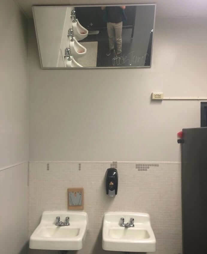
This photo just shows what happens when people try to think outside of the box. It's as if someone asked themselves, "How can we make our school's bathrooms unique and different." And then they thought about hanging their mirrors on the ceiling. Jokes aside, there's probably a reason this mirror was put on the ceiling. School bathrooms are where a lot of fights take place, so we wouldn't be surprised if the faculty got tired of replacing broken mirrors.
If that's the case, then this is honestly a pretty clever solution. Nobody is going to be throwing anybody else up against the mirror in this bathroom if it's located on the ceiling. At least, we certainly hope they aren't
Probably Not The Best Choice Of Shape
Designers have it pretty hard (no pun intended). Not only do they have to make something that functions, but they have to make it both unique and nice to look at. They achieved one of those things in this image. These are shelves for students to hang their coats on, but it seems like a parent, or maybe even a teacher, ended up noticing that they look a bit... strange.
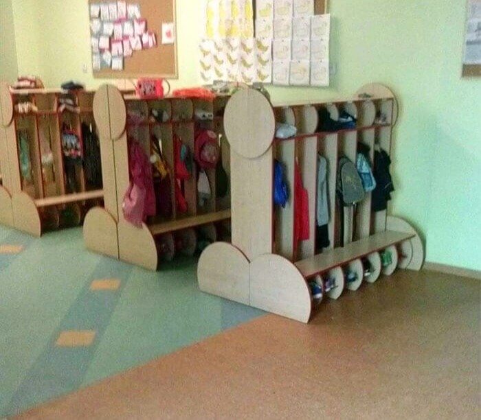
That said, at least they function how they're supposed to, and we're sure all of the kids in this class were too small to notice that their shelves were rated R.
When You Run Out Of Space
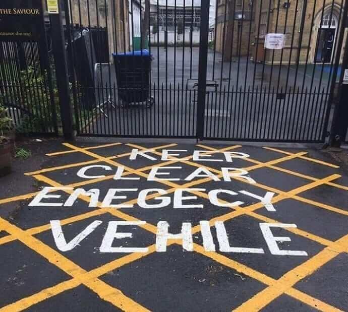
We've all been writing at one point or another and suddenly found ourselves running out of space. Sometimes, this forces us to make sacrifices and cut down on letters or even start writing down the page. We've just never seen something like this happen when it comes to messaging on a road. Here, they couldn't spell emergency or vehicles all the way out and ended up having to completely misspell them.
We particularly like the way they ended up spelling "vehicle." The word "vehile." just sounds like a different version of "vile" or something. Still, we're sure most people could still read this and get the picture.
This Is Just Eerie
So, all of these hands and the color red is supposed to represent incoming freshman at the school. It's a good visualization, but they could've picked a better color. As it stands, this just looks like a scene out of a horror movie or something. It's also a little dark, considering the number of school shootings in the U.S., which is where we assume this photo was taken at.
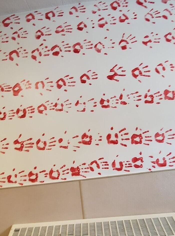
We mean, why red? Why not like the color blue or something? It's much more calming and wouldn't immediately induce a panic attack every time you walk into the school lobby to start your day.
It's A Very Physical Sport
As if there weren't already enough easy jokes about wrestling, this school went and made it that much easier. This mural was painted inside a school in Pontiac, Michigan. It was probably commissioned to celebrate the wrestling team, but we doubt they were very thrilled about it after seeing this. It's a bit R rated to have inside a school gym, and that fact wasn't lost on whoever took this photo.

They even went and added some emojis to their photo. We're sure the school went and changed it as soon as they caught wind of it, though, as students aren't very good at keeping things like this secret.
Makes Us Not Want To Open That Door
If you've ever needed a way to dissuade someone from opening a door, then maybe you could take some tips from this artist. They painted a picture of a polar bear on a door, but his stance is a little awkward. Also, a polar bear must be this school's mascot or something because why else would you have a mural of a polar bear on a door in a school?
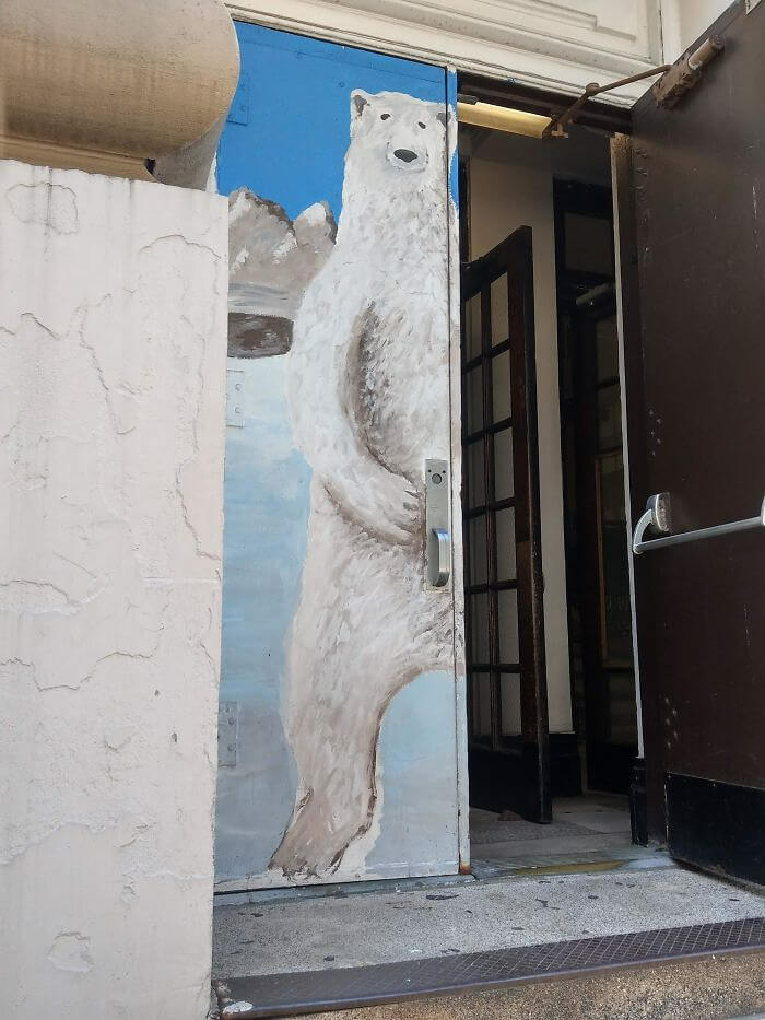
That said, we'd definitely feel some type of way about having to open this door every day walking into the gym or wherever this is placed in the school.
Thanks But No Thanks
Our first thought when we read this was something like someone needs to call the police. This pamphlet just makes us want to scream stranger danger before making a run for it. However, it's meant to be a school pamphlet aimed at children with disabilities, which makes a bit more sense. But we can't help but think that they maybe missed the mark on this one and ended up with a creepy tone.
But it seems like they had good intentions, even if it reads like something that someone who drives a rickety old van might pull up and say to kids playing on the street.
Somethings A Bit Off About The New Statue
This is a photo of a statue that was commissioned for a Catholic school somewhere. Suffice it to say; it wasn't long before someone noticed something a bit off about it and snapped this photo. We won't say what exactly is off about this statue, but we will say the loaf of bread could've been better placed. There's also the fact that this statue was made for a Catholic school.

And they haven't exactly had the best track record recently when it comes to things like this, which makes us wonder if this might've even been a commentary by the artist.
What Happened To Josh's Face?
You might not think about it very often, but printing is actually a really complicated process. Just think about how large the printers in offices are and then think about how large industrial-sized printers have to be in order to print things like books. There are a lot of moving parts that are needed, which can often lead to mistakes. Take this school textbook for example. Something obviously went wrong here.
Something went so wrong that this guy's face ended up being cut off. And it's not like you can just reprint thousands of textbooks at no cost, so they obviously just decided to ship these mistakes and all. It probably would've cost thousands if not more, not to.
That Mascot Needs To Be Reworked
We're not exactly sure where this school is, but we are sure that they might want to consider reworking their mascot or at least their sign out front. It's supposed to be a man plowing a field. Maybe the town is known for its agriculture or something. However, a couple of keen-eyed people happened to notice that the seen looked like something else and snapped a photo of the building.
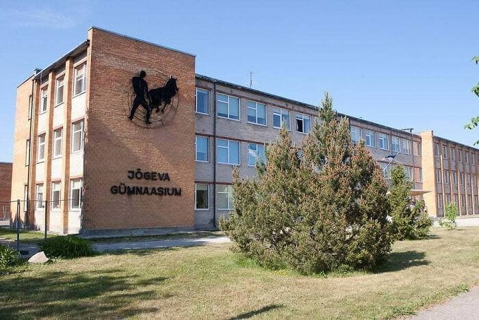
It also kind of appears as if the building is no longer in use, too. If that's the case, then this sign isn't being changed anytime soon, and people are just going to have to get used to it..

